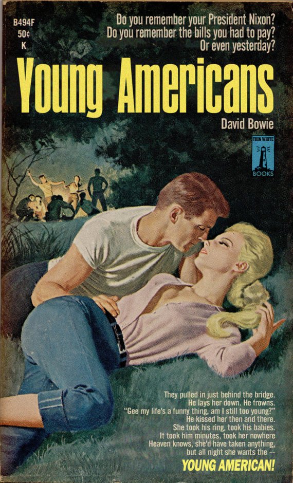
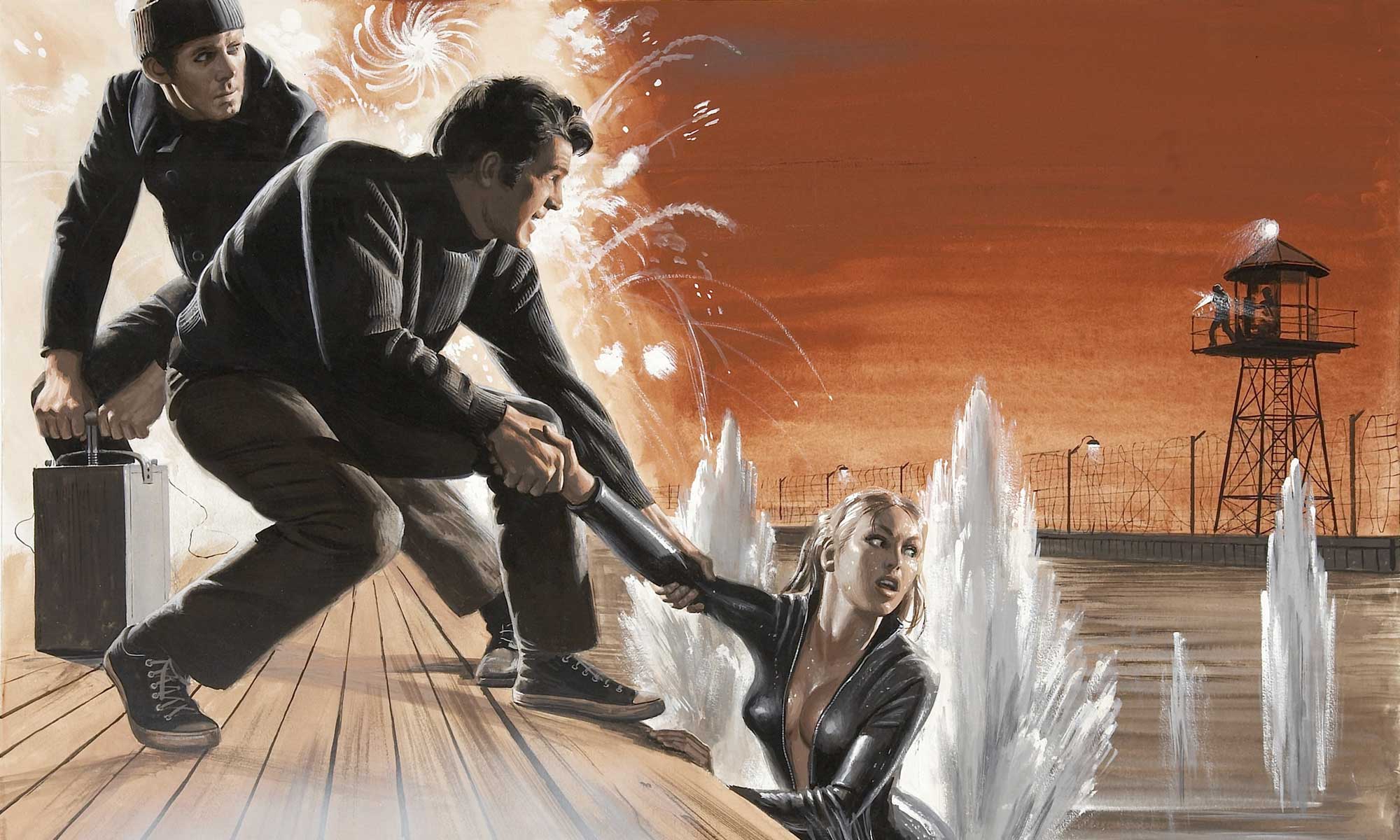
(songs by Bowie, Costello, Talking Heads all re-imagined as pulp book covers)
2 Replies to “All Pulp, All The Time Here”
Lovely.
I decided that I wanted the text to look like the text I’d seen in an ad for a John Lennon album, so I copied that font style. I didn’t know that the font style had a name, but I knew that my instincts for how to draw those letters didn’t match how the letters ended up looking. The font, as it turns out, was Franklin Gothic, and, as a 13-year-old, all I remember was that I would start to draw the “S” and then realize that my “S” didn’t look like Franklin Gothic’s “S,” and that the curvy letters, like “G” and “O,” didn’t look right when they sat on the lines I’d made for the other letters, because of course for a font, the curvy letters have to be a little bit bigger than the straight letters, or else they end up looking too small. I became fascinated with that kind of thing, how one font would give off one kind of feeling, and other one would give off a completely different feeling.
Lovely.
Me too!
This is absolutely brilliant!!! I love all of them.